Post by Jason X on May 3, 2012 13:52:49 GMT -5
I was noticing the other day when the New Jersey Nets announced their new Brooklyn Nets team colors and logos, designed by minor team share-holder Jay-Z, that the new Logo is kinda underwhelming...

Now I understand the concept here. Minimalism. I dig the colors, black and white. They should sell many black jerseys. Its simple but its cool.
The logo(s) however. Traditional-looking. Kind of a 'throwback' vibe. The problem I immediately have is that the new Brooklyn "B in Basketball" logo is incredibly similar to the Boston Bruins classic "Spoked B in Circle" crest. The logo is also very plain.
I'm not from Brooklyn, or even New York, or even the Northeastern United States. I am, however, a sports fan and an observer of the aesthetics of athletic clubs, their logos, and uniforms.
Now lets address the team name. The Nets? I know that they have been "The Nets" since their Long Island ABA days, but this is a NEW Era. A New Town deserves a NEW Team with a Fresh, new Identity.
So I got to thinking about some nicknames. I volleyed about several monikers in my brain for an hour or so. I settled on a Name and set about designing a concept for a logo...
I decided to keep the basic colors of black and white because I think its great for them. I also decided to retain concepts from Jay-Z's original designs, like his "B" Logos and shield designs, and his "BROOKLYN" Word-mark.
For the official team nickname I settled on the "Knights". I liked it, The Brooklyn Knights. Sounded alright. A little reminiscent of the KNicks, but it was a coincidence. The name actually started at "Nets... Nets..." and sort of mnemonically mutated in my mind into "Knights". Also, which would you as a man rather be, a net or a Knight?
So, with a new color scheme and a fresh new identity, I give to Brooklyn their new NBA Basketball Team, the
Brooklyn Knights
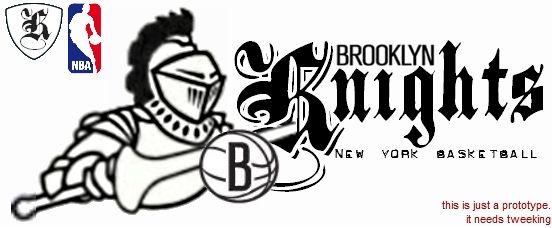
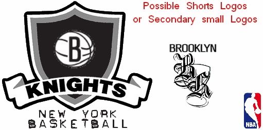
As you can see, these are kinda rough. They definitely need to be re-worked and touched up by a professional graphic designer (which I am not) but you can see the concepts at work here. Obviously they would want to re-work the Knight, change the way he's drawn, maybe change the lance thing to a sword or something...
I kept Jay-Z's original drawings and concepts in place wherever I could and expanded upon them.
I was so inspired by my impromptu rudimentary design project that I decided to Tweet the ideas to several key New Jersey Nets people including:
Jay-Z (@jayz), Minor Team Owner and Designer of Brooklyn logos.
Mikhail Prokhorov (md_Prokhorov), Russian Billionaire and actual owner of the Nets.
Billy King (@bkdefend), Nets General Manager
as well as the Nets Public Relations Department (@nets_PR) and several Nets beat writers and bloggers.
I'm not sure what I really hope to get out of this. Nothing, I guess. But I had an idea and I just needed to share it with the world. Thanks to the Twitternets maybe the right people will see it and ponder...
I tagged my messages with the hashpound #NBABrooklynKnights
If you like my idea maybe you can bounce it around Twitter and we can get some sort of mini-movement started.
Now I understand the concept here. Minimalism. I dig the colors, black and white. They should sell many black jerseys. Its simple but its cool.
The logo(s) however. Traditional-looking. Kind of a 'throwback' vibe. The problem I immediately have is that the new Brooklyn "B in Basketball" logo is incredibly similar to the Boston Bruins classic "Spoked B in Circle" crest. The logo is also very plain.
I'm not from Brooklyn, or even New York, or even the Northeastern United States. I am, however, a sports fan and an observer of the aesthetics of athletic clubs, their logos, and uniforms.
Now lets address the team name. The Nets? I know that they have been "The Nets" since their Long Island ABA days, but this is a NEW Era. A New Town deserves a NEW Team with a Fresh, new Identity.
So I got to thinking about some nicknames. I volleyed about several monikers in my brain for an hour or so. I settled on a Name and set about designing a concept for a logo...
I decided to keep the basic colors of black and white because I think its great for them. I also decided to retain concepts from Jay-Z's original designs, like his "B" Logos and shield designs, and his "BROOKLYN" Word-mark.
For the official team nickname I settled on the "Knights". I liked it, The Brooklyn Knights. Sounded alright. A little reminiscent of the KNicks, but it was a coincidence. The name actually started at "Nets... Nets..." and sort of mnemonically mutated in my mind into "Knights". Also, which would you as a man rather be, a net or a Knight?
So, with a new color scheme and a fresh new identity, I give to Brooklyn their new NBA Basketball Team, the
Brooklyn Knights
As you can see, these are kinda rough. They definitely need to be re-worked and touched up by a professional graphic designer (which I am not) but you can see the concepts at work here. Obviously they would want to re-work the Knight, change the way he's drawn, maybe change the lance thing to a sword or something...
I kept Jay-Z's original drawings and concepts in place wherever I could and expanded upon them.
I was so inspired by my impromptu rudimentary design project that I decided to Tweet the ideas to several key New Jersey Nets people including:
Jay-Z (@jayz), Minor Team Owner and Designer of Brooklyn logos.
Mikhail Prokhorov (md_Prokhorov), Russian Billionaire and actual owner of the Nets.
Billy King (@bkdefend), Nets General Manager
as well as the Nets Public Relations Department (@nets_PR) and several Nets beat writers and bloggers.
I'm not sure what I really hope to get out of this. Nothing, I guess. But I had an idea and I just needed to share it with the world. Thanks to the Twitternets maybe the right people will see it and ponder...
I tagged my messages with the hashpound #NBABrooklynKnights
If you like my idea maybe you can bounce it around Twitter and we can get some sort of mini-movement started.